Friday, April 23, 2010

Histogram

http://www.cyber-wit.com/images/gallery/histogram1_b.png


A histogram represents information in tabular frequencies. In this example there are adjacent rectangles, which represent frequencies over an interval.

Box Plot


Box Plots are nicknamed "whisker plots" and graphically depicts numerical data through five number summaries. Box Plots are non-parametric and can be used to display differences in populations without making underlying assumptions about the underlying statistical distribution.


http://www.lohninger.com/comimg/boxplot.gif

Stem and Leaf Plot


The stem and leaf plot presents quantitative data in a graphical format.

http://www.mrexcel.com/chal070106.jpg

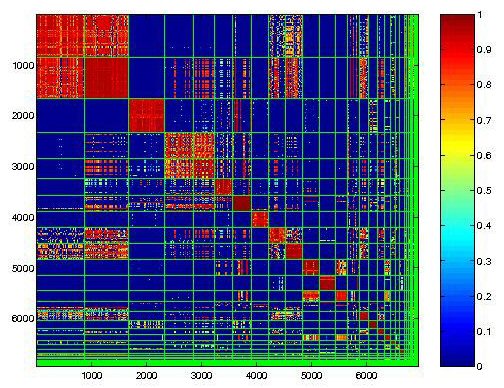
Similarity Matrix


A Similarity Matrix is a matrix of scores which express the similarity between two data points.

http://cgi.mtc.sri.com/Cluster-Lab/01.jpg

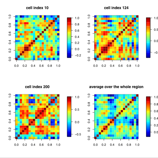
Correlation Matrix


This type of map shows correlations between all pairs of data sets. The Matrices above are of climate data sets.


http://www.image.ucar.edu/GSP/Projects/JunIPCCModelBiasCorrelations.jpg

Infrared Aerial Photo

Infrared Aerial Photos can show differences in land coverings. The one above is of Delta National Park. It can be used as a tool, to show changes in the environment, damaged structures, the health of the environment, and muchmore.
http://www.deltanationalpark.org/images/images/discovery-bay-aerial-web.jpg

Cartographic Animations

http://maps.unomaha.edu/AnimArt/ActiveLegend/JavaScript/java.html

The link above directs you to an example of a cartographic Animated map. Which is a map that entails some sort of movement.